It was in 2010 that I decided: enough was enough. Postage costs going ever upwards, folk I heard nothing of from one year to the next, cards sent and not received, people overlooked, postal deadlines missed, cards destined for landfill, glitter everywhere, none recyclable, or too good to discard so cluttering the place up for weeks or even years, etc etc.
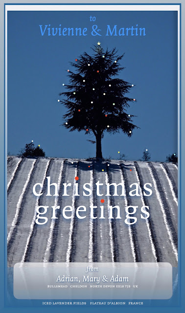
I came up, quite independently of anyone who had thought of it before, with the Bullsmead e-greet. Unlike other e-greets I have seen since my first 2010 attempts, mine are always tailored to the specific recipient(s) insofar as the greeting carries their name(s). Unsurprisingly I received some slightly scornful observations at first: I still get the odd one even now. But I have at least taken the time to design my greeting on a personal basis, with something topical perhaps, certainly something seasonal — with an image derived from my own photographs and design, specifically worked into a customised greeting. So what if it is sent via the Internet? There's nothing to stop folk printing the e-greet out and sticking it on the mantelpiece, after all. Money saved in postage goes to increase the financial support I make to this seasonal good cause or that. The sending of an e-greet has also sometimes stimulated and renewed a contact that might otherwise have been at risk of withering away entirely. I send them out as a family greeting, but neither the son-&-heir or Mrs Melling take any part in originating the yearly offering, other than to draw my attention to weaknesses or errors in the design, layout, recipient and so on.

For some reason I have no record of the 2015 card (the sixth image down from the top) with its typography, I've just got the image I made. But I'm sure you can envision how it probably looked, on the basis of the other years before and after… approximately at least. No? Oh well, we can't all be typographically adept can we? For my public who might want such detail, the house-style type face for this series is generally Monotype Photina.
But not always! Can you spot the other faces?